“Fabrics have a presence and a warmth totally different from paint or photography. As a result, many people respond to quits in a very personal way.” Ruth Mc Dowell, a Fabric Journey, 2005, p. 43
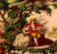
Picture two avid quilters shopping in an antique mall in southern Missouri. Together they spot a gorgeous vintage decorating fabric featuring rustic pictorial motifs printed in muted colors. Both are fascinated by this unusual fabric. Who gets to buy it? There was an easy answer for Joan Beyette and Robin Bodishbaugh–they will split it! These women are quilter friends of mine with creative minds. Let them tell their stories about the making of their quilts inspired by this fabric encounter.
Robin speaks first:
Joan and I found this piece of vintage light-weight upholstery fabric with enough yardage to split. We each thought it would be fun to use the pictorial motifs as medallions in blended quilts, a style we both appreciate.
I wanted a soft, blended look to my quilt and liked the way the gray plaid I found worked by emphasizing the grays in the center tableau. I had originally pulled several soft pinks along with the greens, but ended up limiting the use of pink to keep the effect almost monochromatic. I threw in a few squares of muted tone-on-tone ocher here and there to echo the gold in the scene, as well as some gray and gold paisleys, but if I had it to do over again, I would omit the tone-on-tone because I think it calls too much attention to itself. I placed triangles in the corners of the center square to allow the eye to zero in on the two individuals in the tableau–an effect I learned from Paula. The two fabrics in the center triangles are both French, which adds to the French provincial effect.

Robin chose this contrasting plaid to frame her tableau.
In addition to the gray plaid, my first set of fabrics were almost all Daiwabos featuring muted gray-greens and soft pinks. Eventually, I decided that the blended effect needed more floral vines and paisleys. I think there’s only one of the muted Daiwabo fabrics in the finished top. I used one in the half-square triangles and again scattered around in the blended sections.
The pattern I adapted for my quilt is called Toile Medallion from Quiltmania by Margaret Sampson George. I had planned to add the other 4″ borders like the pattern, but the quilt seemed finished when I put the corner squares on, so I stopped there. This quilt is 45″ square and I named it “Le Petit Oiseau,” which means “The Little Bird.”

Joan tells us her experience:
These two quilt tops were inspired by a gorgeous vintage decorating fabric Robin and I found in an antique mall in Missouri. After splitting the large piece we vowed to make quilts with our find. We both love the McCloskey/Yenter blended quilts books and had this style in mind.
For my quilt I was influenced by Robin’s color palette used on another of her projects. I was determined to make a cool gray, sophisticated quilt and purchased fabric with that in mind. I also bought a rosy pink for an accent. Once I placed that rosy pink around the central scenic panel, I couldn’t direct the quilt to my original vision!

I found that only pinks and greens drew me in. Finally I just allowed myself three days to play and follow my intuition. The colors chose themselves. I love this quilt, naming it Versailles, as earlier Robin said one of my fabrics had a “Versailles feel” to it. The pattern Aegean is one out of Quilt Mania, but I kept simplifying it until it no longer resembles the original pattern.
Another quilter friend, Donna Alsobrook, suggested that I give the cool, sophisticated gray idea another chance since I still had a section of the original panel. I proceeded to pull out blacks, grays, and browns from my stash and from some recent purchases. I found myself struggling with this new direction until I came across a reproduction pillar print featuring a gray floral. Perfect! Still feminine and gorgeous, but understated. This time I worked with a pattern from Yenter’s Blended Wall Quilts and used soft greens to add subtle color. I found several small, much-treasured bits of floral fabrics I had been hoarding, and these provided the bit of feminine sparkle I needed.

I love this quilt, too! It is not the cool gray I first intended, but a new look and tone for me. Versailles II is my name for this version.
Paula concludes: Playing with fabric can be a joint adventure–whether it is a “round robin ” quilt or quilts featuring a unique fabric or technique. Fabrics do have a presence and a warmth we can respond to with energy and enthusiasm. We quilters inspire each other to create and we appreciate the long artistic heritage of “borrowing” ideas from each other as we improvise and play.
Paula I enjoyed reading this about how two good friends can encourage and inspire each other. So fun to see how each quilt has it own personality created by its maker.
They are so talented and two really sweet ladies. Thank you